When people think about a website, they typically envision the website on a laptop or desktop computer. It’s how websites are typically designed and evaluated. Over the past 20 years or so, this is how people have browsed the Internet. But is it still the best way to represent yourself? Research shows that mobile device usage is increasing dramatically, and people are using desktop/laptop computers less frequently than they used to. As a result, desktop websites could be less important than you think.
Mobile Websites
A mobile site used to be a novelty. It was a way to reach early adapters that had mobile devices capable of displaying webpages. Over time, as more people adapted to mobile devices, a mobile website became a more effective means of generating leads. In the case of healthcare practices, it was a vehicle for new patients to find the practice and for patients to schedule appointments and conveniently gather information. However, separate mobile sites are much more difficult to update as they create double the work (two sites to update) and typically have a limited amount of information. This brought rise to responsive websites…
Mobile Responsive Websites
Mobile responsive websites are simply websites that respond to the device being used. They adjust the size and position of the elements to be easily readable and organized based on the device being used. (You can try it with our site by just changing the size of this window and see how the elements shift.) Responsive design resolves the issues of updating two websites and having limited content. It’s also Google’s preferred method. For more information on responsive designs, you can see our full mobile marketing page.
Going a New Direction
Modern thinking says think desktop, but be mobile ready. But, modern thinking is dangerously teetering on becoming outdated. With 64 percent of all American adults owning a smartphone (and 80 percent of online adults using a smartphone), it’s vital to be mobile-friendly. In fact, we could now argue that it is more important, especially in healthcare, to have a mobile website than a desktop website. Consider the following:
- Healthcare often has an urgent nature associated with it, meaning people will be using their phones
- Moms (who are often the healthcare decision makers in the house) are typically on the go and much less likely to be in front of a computer
- Users on mobile devices are more likely to be ready to take action
- People are carrying phones with them everywhere they go and using them at a higher rate outside of the office than desktop (and sometimes even more than in the office)
- Points Group now has clients whose website traffic is higher on mobile devices than it is on desktop/laptop
A recent study by Google found that 44% of patients who found hospitals on their mobile phone went on to schedule an appointment.
A modern, responsive (mobile friendly) website is a necessity in order to take full advantage of that high conversion rate.
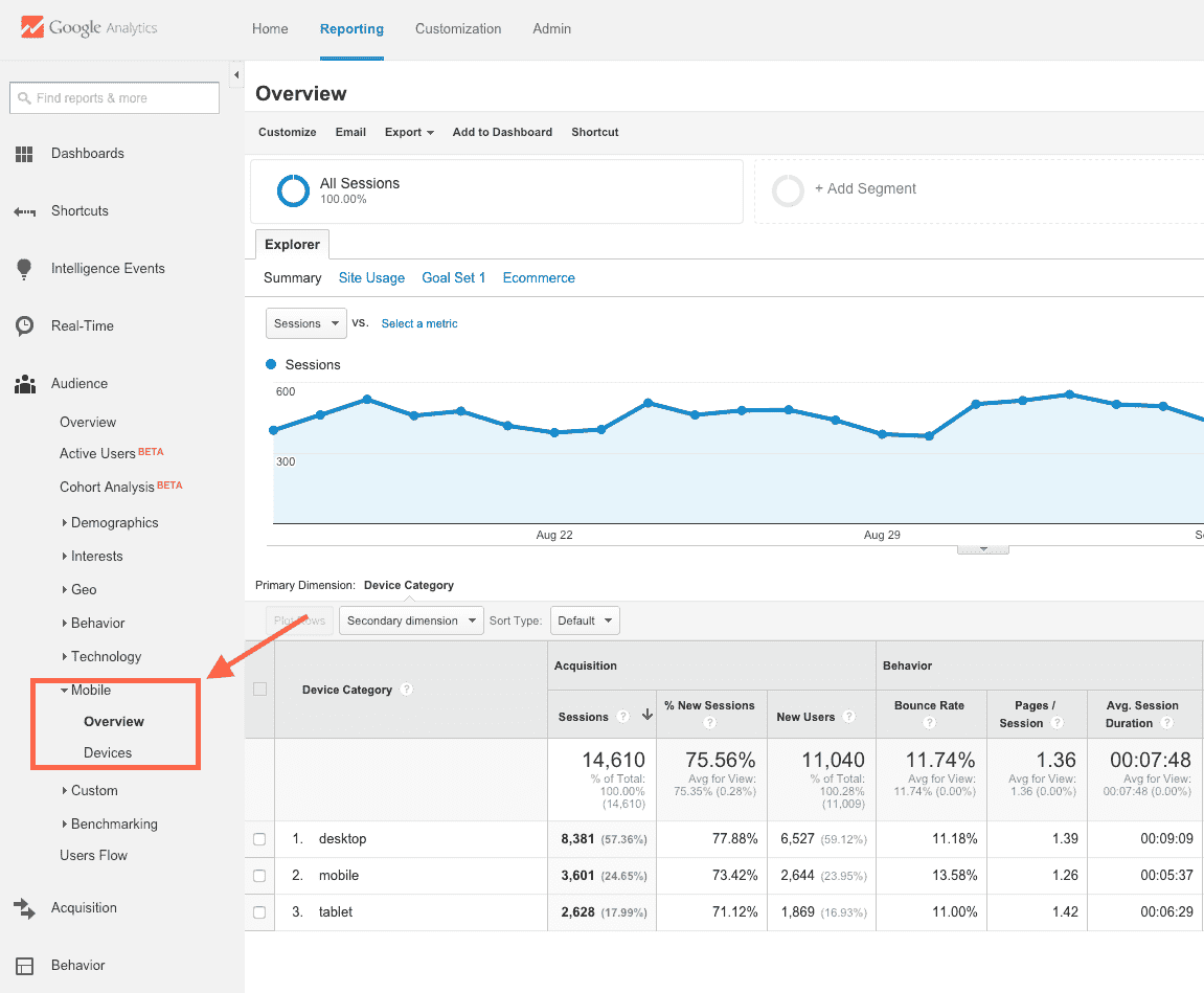
If you’re unsure about how much traffic your site is getting on mobile devices, you can quickly look in Google Analytics if it is installed on your website. After you log in, simply click on “Audience,” then “Mobile” and “Overview”. This will show you how many users are viewing your website in the different device types. (You can also get VERY granular down to the type of device if you click on “Devices” instead of “Overview”.)
All of this points to the fact that mobile needs to be a much higher priority – and in many cases needs to be thought of first. If you’re in healthcare and your website does not get more than 50 percent of its visits from mobile devices, it most likely will within the next year. The only exception is deeply researched topics, as research is performed slightly more often on desktop computers. This could include reconstructive surgeries or cancer treatments. However, even these segments have a heavy mobile component.
What Do You Need to Do to Go Mobile?
There are multiple elements to consider when “going mobile” and thinking “mobile first”. We would certainly recommend starting with a responsive website. If not already, in the near future, you will need to think “inversely responsive” – designing a good mobile experience and making sure that it can adjust to desktop. What has to be different on a mobile website? Here are some elements that you’ll need to think through:
- Simple contact form: People don’t want to fill out long forms on mobile devices. They’ll go somewhere else before they spend too much time trying to type through too many fields. You may not get every piece of information you want, but at least you get something. Keep the contact form brief and limit it to essential information. You can get more info later with a follow-up call.
- Easy-to-find contact information: Mobile devices typically recognize phone numbers and addresses, and users are familiar with clicking to either call or get directions. These elements should both be prominent on every page of your site. If you have too many locations for this to be feasible, list at least a phone number and an easily accessible “locations” page.
- Easy buttons for touch: People suffer from “fat finger syndrome”. If buttons are small or close together, it adds difficulty. Make sure you test the buttons to make sure they’re easy to use.
- Appropriate size and format: Make sure that the elements you are using aren’t too big, are built for mobile and align well. Mobile devices still don’t have the processing power of full computers and will load a little slower, so keep that in mind. Also, in a responsive design, a contact form on the sidebar of a desktop version may be pushed to the bottom in the mobile responsive version. Think through this before you pull the trigger.
- Keep the most important info on top: The “fold” (the area visible without any scrolling) is much higher on a mobile device than a desktop. Not everyone scrolls very far, so make sure your most important content is at the top.
If you’re thinking about a new site (or haven’t thought about it in a while!), it’s time to start thinking predominantly mobile. At Points Group, we understand the importance of mobile. We know how to build a great site and how to create websites effectively for healthcare practices.